Welcome to the grand finale of our series, “The Anatomy of a High-Converting Landing Page.”
Over the past few weeks, we’ve built a powerful landing page from the top down. We started by crafting a killer hero section to make an unforgettable first impression. We learned how to build credibility with powerful social proof and connect with customers by turning features into compelling benefits. Most recently, we removed friction by proactively handling objections with a strategic FAQ section.
Your visitor has now read everything. They are interested, they trust you, they understand the value, and their doubts have been erased. They are ready to buy.
There’s just one problem: the “Buy Now” button is all the way back at the top of the page.
Every moment of hesitation or friction can kill a sale. Asking your most engaged visitor to scroll back up is a huge, unnecessary risk. That’s why we end every landing page with the final, crucial element: The Final Call-to-Action (CTA) Section.
The Final CTA: Your Last Chance to Convert
Think of your landing page as a great salesperson. They wouldn’t give their entire pitch and then just stand there silently, waiting for the customer to make the next move. They would ask for the sale.
The final CTA section is your landing page asking for the sale. Its job is to make the decision to buy not only easy but also completely risk-free for your most qualified visitors—the ones who have scrolled all the way to the bottom.
The 3 Key Elements of a High-Converting Final CTA
This section doesn’t need to be complicated. It just needs to be clear, reassuring, and direct. Here are the three elements it must include.
1. A Benefit-Driven Headline
Don’t just say “Buy Now.” Remind the visitor of the amazing transformation or result they are about to receive. Reiterate your core promise and connect it to the action you want them to take.
- Examples:
- “Ready to Finally Get a Good Night’s Sleep?”
- “Join 50,000+ Stores That Sell More With [Your App Name]”
- “Get Your Dream Skincare Routine Delivered.”
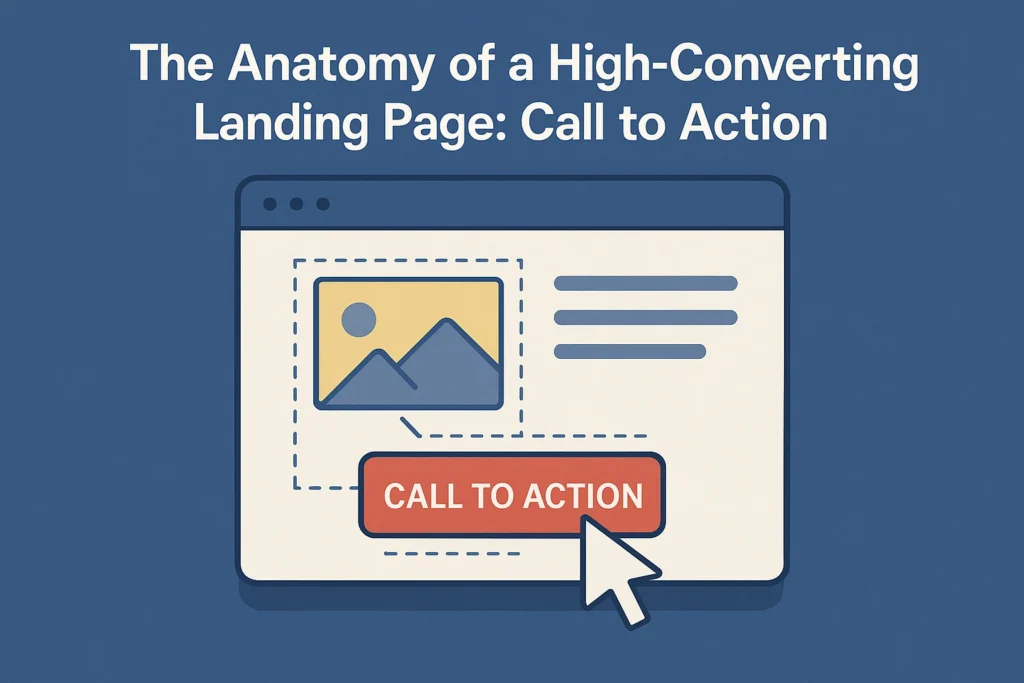
2. A Bold, Unmistakable CTA Button
This is the star of the show. The button itself should be a visual anchor—large, bright, and with plenty of empty space around it so it stands out.
The button text should be the same clear, action-oriented copy you used in your hero section. Consistency is key. If your first button said “Start My Free Trial,” this one should too.
3. Trust Seals and Guarantees
This is where you erase any last-second jitters. Right below your CTA button, include visual trust signals that make the purchase feel 100% safe.
- Money-Back Guarantee: Display a “30-Day Money-Back Guarantee” or “100% Satisfaction Guarantee” seal. This is the ultimate risk-reversal.
- Secure Payment Logos: Show logos for Visa, Mastercard, PayPal, etc. This reassures customers that their financial information is safe.
- Free Shipping / Easy Returns: Mention any policies that make the purchase more convenient and stress-free.
The Bottom Line: You’ve Finished the Series!
And that’s it! From the initial hook to the final handshake, you now have the complete blueprint for a landing page that converts. By guiding your customer on a seamless journey—grabbing their attention, earning their trust, showing them the value, answering their questions, and finally, asking for the sale—you create an experience that feels less like a sales pitch and more like a solution.
Ready to put it all together and build a landing page that drives results?
This series has given you the blueprint, but expert execution makes all the difference. If you’re a Shopify merchant ready to implement these strategies with a professionally designed, high-converting landing page, my work is just beginning.
[Click here to schedule your free, no-obligation landing page audit today.]